After you create a chart, you can instantly change its look. Instead of manually adding or changing chart elements or formatting the chart, you can quickly apply a predefined layout and style to your chart. SmartTutor 360 provides a variety of useful predefined layouts and styles (or quick layouts and quick styles) that you can select from. However, you can customize a layout or style of a chart further by manually changing the layout and style of the individual chart elements that are used in the chart.
There are several options for chart-style customizations in the chart Properties pane > Chart Style. This section allows you to customize the background fill and line of the datasets, as well as gridlines, tick labels, and axis labels.
Customize Series
The Series means data values presented in colored horizontal bars. Click the drop-down Series list to switch to any dataset you want to customize.
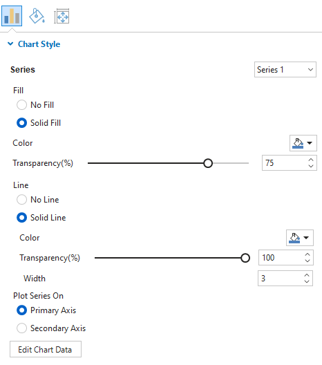
- Fill and Border: Fill the dataset and its line border with a single color, respectively.
- Plot Dataset On: Choose between Primary Axis and Secondary Axis to plot a dataset on.
Note: You cannot plot all the datasets in the secondary axis.
Customize Scale Options
In this section, feel free to adjust the gridlines, tick labels, and axis labels corresponding to the axis that the dataset is plotted on.
Click the drop-down Axis to choose one of the chart axes to customize its properties. There are four types of axes: Primary Horizontal, Primary Vertical, Secondary Horizontal, and Secondary Vertical.
Note: The properties for the Secondary Horizontal and Secondary Vertical options are only available when you plot at least one dataset on the Secondary axis.
Gridlines are lines that cross the chart area to indicate the divisions on the axes. You can choose to draw gridlines of the currently selected axis with a single color or not. Adjust the transparency and the width of the gridlines the way you want.
- Dash Pattern: Change the pattern of gridlines.
- Draw On Chart Area: Tick the checkbox to draw horizontal/vertical gridlines on the chart area. Drawing gridlines helps viewers understand what values are represented by unlabeled data points.
- Draw Tick Mark: Tick the checkbox to draw lines which are the extension of the gridlines from the axis border to the tick labels.
- Draw Border: Tick the checkbox to draw a line border at the edge intersecting with the corresponding axis.
Tick Labels
Fill the tick labels of the corresponding axis with a single color. You can also change the font name, font size, and make tick labels bold and/or italic the way you want. Otherwise, if you want the axis to have no tick labels, just select Text No Fill.
Axis Label
Fill the axis label of the corresponding axis with a single color. Enter a new name of the axis label in the Text field. Moreover, change the font name, font size, bold, and/or italicize the axis label as your like. If you don’t want to show the axis label, select Text No Fill.
Note: The Secondary Vertical axis has no tick labels and axis label.
Adjust Chart Layout
Chances are you want to re-organize the chart layout, you can do that by accessing the chart Properties pane > Size & Properties > Layout.