Theme colors determine the default color options throughout SmartTutor 360. By switching to different theme colors, you can easily change the style of a SmartTutor 360 template. Several built-in themes are available, and you can also create your own custom themes.
Understanding Theme Colors
Theme colors set the default options for text, shapes, captions, outlines, buttons, and more. In the selection window, theme colors are displayed in the top row, with different shades of each color below. (You’ll also find 10 standard colors and the option to define custom colors.)
To view your gallery of theme colors, go to the Design tab on the ribbon and click Colors.
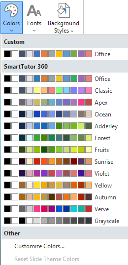
Custom theme colors you’ve created will appear at the top of the list, with built-in theme colors listed below. The theme colors currently used on the selected slide are outlined in a thin orange line.
Each theme includes a palette of eight colors: the first two are for text and backgrounds, while the remaining six are accent colors, such as those used for shape fills. To view the full color palette of a theme or to modify it, refer to the Customizing Colors section later in this guide
Applying and Managing Theme Colors
Hover over a set of theme colors to preview what they’d look like if applied to the current slide. Just click a theme to actually apply it. (Clicking a theme applies it to all slides that share the same slide master as the current slide.)
Right-click a theme to see these additional options:
| Apply to Matching Slides | This applies the theme colors to all slides in your course that are based on the same slide master as the current slide. (You can achieve the same thing by left-clicking the theme.) |
| Apply to All Slides | This applies the theme colors to all slides in your course. |
| Apply Only to This Slide | This applies the theme colors only to the currently selected slide(s). |
| Edit | This opens the theme editor. (See Customizing Theme Colors below.) This option is only available for theme colors you’ve created, not built-in theme colors. |
| Delete | This removes the selected theme colors from SmartTutor 360. This option is only available for theme colors you’ve created, not built-in theme colors. |
Creating New Theme Colors
Here’s how to create a new set of theme colors:
- Go to the Design tab on the ribbon and click Colors.
- Select Create New Theme Colors at the bottom of the drop-down list.
- When the theme editor appears, use the color selectors to assemble your palette.
- Text/Background – Light 1 is the default text color for dark slide backgrounds and shapes. It’s also one of the slide background styles on the ribbon’s Design tab.
- Text/Background – Dark 1 is the default text color for light slide backgrounds and shapes. It’s also one of the slide background styles on the ribbon’s Design tab.
- Text/Background – Light 2 and Text/Background – Dark 2 are slide background styles on the ribbon’s Design tab. (Dark 2 is also used as the background color in the Text Styles drop-down list when you’re using light text on a dark background.)
- Accent 1 is the default fill color for shapes, captions, check box styles 1 and 2, and radio button styles 1 and 2.
- Accents 2-6 are colors you can choose in style galleries and color selectors throughout SmartTutor 360.
- Hyperlink is the color used for text hyperlinks.
- Control 1 is the hover color for radio buttons and answer choices (except drag items, drop-down questions, and Likert scale questions, which use Custom 2).
- Quiz – Correct is the default color for accessible correct quiz elements, such as icons and review banners. (Learn more about feedback theme colors.)
- Quiz – Incorrect is the default color for accessible incorrect quiz elements, such as icons and review banners. (Learn more about feedback theme colors.)
- Custom 1 is the default fill color for buttons.
- Custom 2 is the default color for check box styles 3 and 4 as well as radio button styles 3 and 4. It’s also the hover color for drag items, drop-down questions, and Likert scale questions.
- Enter a name for your new theme colors.
- Click Save.
Customizing Theme Colors
It’s easy to modify your custom theme colors. Here’s how:
- Go to the Design tab on the ribbon and click Colors.
- Right-click the custom theme colors you want to modify and select Edit.
- When the theme editor appears, use the color selectors to modify your palette.
Built-in theme colors can’t be modified. However, you can create your own theme colors based on built-in themes. Here’s how:
- First, apply the built-in theme colors you want to use as your base colors to your course (i.e., left-click the built-in theme).
- Then, click the Colors drop-down again and choose Create New Theme Colors. The theme editor will open, and the colors will default to those from the built-in theme you’re currently using (from step 1).
- Edit the colors to your liking and save the theme with a new name.