SmartTutor 360 is a powerful tool for creating interactive e-learning content, including the use of radio buttons for quizzes, surveys, or forms. Here’s a basic tutorial on how to work with radio buttons in SmartTutor 360
Insert Radio Buttons
Go to the Home tab > Insert tab > Input dropdown > Radio Button
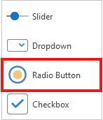
Click anywhere on the Canvas, or hold and drag the mouse on the Canvas then release it.
Customize Radio Buttons
When you add a new object, it shows up with a basic look, and its color might change depending on the theme. But don’t worry—you can change it if you want! The Format tab has lots of options to make it just the way you like.
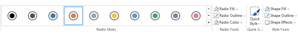
| Radio Styles | Apply built-in quick styles to radio buttons | |
| Radio Fill | Fill the selected radio button with a solid color. |  |
| Radio Outline | Pick the color, width for the outline of your radio button. |  |
| Radio Color | Specify the color for checkmark of the selected radio button. | 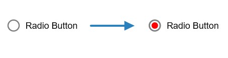 |
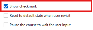
Show Checkmark
To show or hide checkmark , click Properties tab -> Show Checkmark
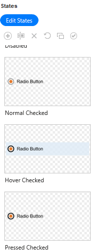
Working with States
A radio button object comes with 8 built-in states. They control its look when users interact with it.
- Normal (Default): This is the initial state when it first appears in the output.
- Hover: The state when users hover the mouse over it.
- Pressed: The state when users click on it.
- Disabled: The state when it is disabled. In this state, it is still visible to users, but they cannot interact with it.
- Normal Checked, Hover Checked, Press Checked, Disabled Checked: These are the states of selected checkboxes or radio buttons.
You can customize those built-in states or add more states if necessary.
For more information, see How to Change States of Objects.
Add Actions
These objects don’t have actions when you first use them, unlike some others. But if you add feedback messages, SmartTutor 360 will automatically create actions to show the message when needed.
| On Check | Occur when users uncheck it. |
| On Uncheck | Occur when users check it. |
| On Timeout | Occur when users don’t respond within the specified time. |
| On Mouse Enter: | Occur when the mouse rolls over it. |
| On Mouse Leave | Occur when the mouse rolls out of it. |
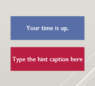
Insert and Customize Feedback Caption
You can add two feedback messages to a radio button. They are Timeout Message and Hint Message: